Home AI Technology Gaming Future Automobile Geography Top 10 Trending How To Discover
Macro Discovery

Technology

See All
Premium editorial infographic showing a crossed-lines chart of two percentage lines tracking shares of global electricity from 2000 to 2025. The renewables line (solar gold) rises from approximately 19% in 2000, accelerating sharply from 2015 onward to reach 33.8% in 2025. The coal line (dark grey) falls from approximately 40% in 2000 to 33.0% in 2025. The two lines cross in 2025, highlighted with a gold starburst labelled "2025 — First time in 100 years." Below the chart, three callouts show: solar met 75% of demand growth, global capacity reached 5,149 GW (IRENA), and battery costs fell 45% in 2025. Based on EMBER Global Electricity Review 2026 (primary, ember-energy.org, April 21, 2026) and IRENA Renewable Capacity Statistics 2026 (primary, March 31, 2026). Countries Winning the Green Energy Race.

Ranked: The Countries Winning the Green Energy Race

Sukh Dhaliwal
|
August 14, 2026

Countries Winning the Green Energy Race , Which country has the most renewable energy in…..

Premium editorial infographic showing the global semiconductor supply chain as a vertical pipeline with five stages, each colour-coded by dominant country. From top to bottom: Design (USA — NVIDIA, Apple, Qualcomm, AMD), EUV Lithography Machines (Netherlands — ASML, sole global supplier), Fab- rication (Taiwan — TSMC, 92% of cutting-edge chips, for Apple, NVIDIA, AMD, and Broadcom), Memory (South Korea — SK Hynix and Samsung, HBM market $54.6 billion in 2026), and Packaging/Assembly (Japan, China, and Southeast Asia). Three callout boxes on the right highlight: global chip sales of $791.7 billion in 2025 (record, SIA primary), the $1 trillion projection for 2026 (first in history), and Taiwan's 92% concentration risk. Based on SIA primary data (semiconductors.org) and TSMC's SEC 6-K filing (March 4, 2025). Global Semiconductor Race.

Mapped: The Global Semiconductor Race

Sukh Dhaliwal
|
August 13, 2026

Global Semiconductor Race , What is the size of the global semiconductor market in 2025…..

Premium editorial infographic showing a flat-vector petri dish divided into two zones: the left zone in clinical teal represents treatable infections (5 in 6 bacterial infections globally), while the right zone fills progressively with red dots representing resistant infections — currently 1 in 6 globally and 1 in 3 in South-East Asia and the Eastern Mediterranean. Four callout boxes surrounding the dish show the key statistics: 4.7 million deaths associated with AMR annually, 39 million direct deaths projected 2025-2050 (3 per minute), and the WHO's July 2026 statement that "few new medicines" are in the pipeline. Based on WHO primary data (who.int, July 16, 2026) and Lancet GRAM 2024. Part of MacroDiscovery's "Visualized: The Global Antibiotic Crisis."

Visualized: The Global Antibiotic Crisis

Sukh Dhaliwal
|
August 11, 2026

Global Antibiotic Crisis , What is antibiotic resistance and why is it a crisis? ,…..

Premium editorial infographic showing a three-level podium chart with Amazon on the tallest platform at $716.9 billion revenue for FY2025 — the first time Amazon has ranked #1 in Fortune Global 500 history, ending Walmart's 12-year reign. Walmart's $713.2 billion platform sits just below, with a callout noting the gap is under $4 billion. A profit panel highlights Alphabet's $132 billion net profit as the world's most profitable company. Part of MacroDiscovery's "Ranked: The World's Biggest Companies by Revenue" article based on Fortune Global 500 2026 primary data. The World's Biggest Companies by Revenue.

Ranked: The World’s Biggest Companies by Revenue

Sukh Dhaliwal
|
August 10, 2026

World’s Biggest Companies by Revenue , What is the world’s largest company by revenue? ,…..

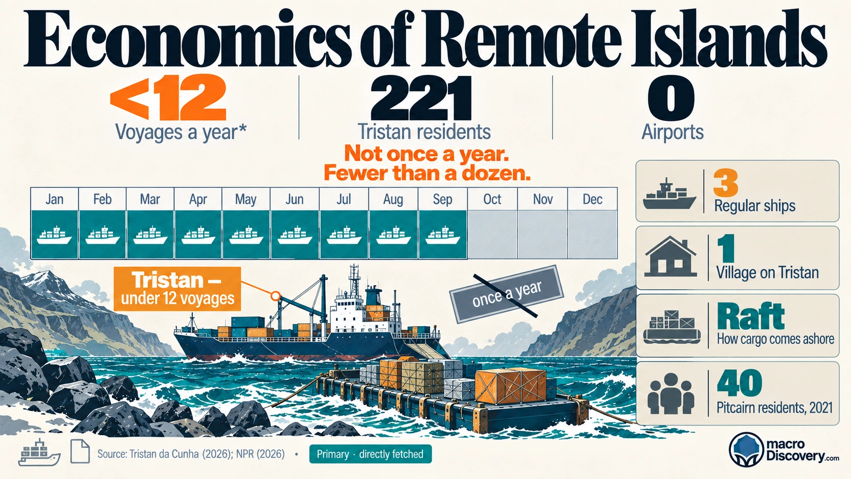
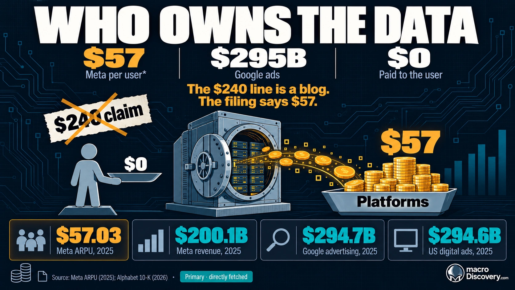
The Economics of Social Media

Visualized: The Economics of Social Media

Sukh Dhaliwal
|
August 6, 2026

The Economics of Social Media , The Economics of Social Media — Revenue, Creators &…..

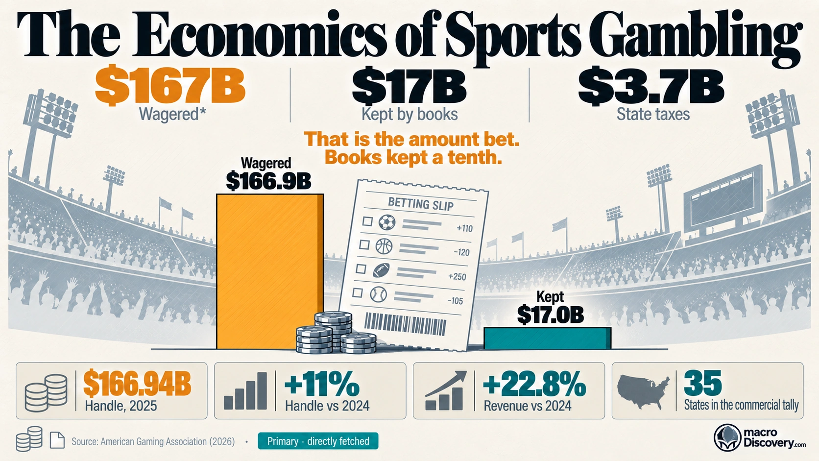
The Economics of Cryptocurrency

Visualized: The Economics of Cryptocurrency

Sukh Dhaliwal
|
August 4, 2026

The Economics of Cryptocurrency , Economics of Cryptocurrency — What the Data Actually Shows ,…..

Future

See All
Premium editorial infographic showing a triptych of three vertical panels comparing work arrangements. The left panel (emerald green) represents hybrid work, showing Stanford/Nature evidence of zero productivity loss, 33% fewer resignations, and 55% employee preference — labelled "Win-Win-Win." The centre panel (grey) represents fully remote, noting mixed productivity evidence and possible advancement penalty. The right panel (red) represents fully in-office, showing 33% higher resignation risk and 41% harder to fill roles — labelled "Paying a Price." Below all three panels, a unified horizontal bar shows the current US split among remote- capable workers (Gallup Q1 2026): 52% hybrid, 27% remote, 20% in-office. Based on Stanford/Nature primary data (news.stanford.edu, June 2024), BLS March 2026, and Gallup Q1 2026. Part of MacroDiscovery's "Compared: The Future of Work From Home."

Compared: The Future of Work From Home

Sukh Dhaliwal
|
August 13, 2026

Future of Work From Home , Is working from home actually productive? , What percentage…..

Premium editorial infographic showing a flat-vector funnel diagram illustrating the $124 trillion Great Wealth Transfer from 2024 to 2048. The funnel top shows $93 trillion in boomer assets (three times US GDP) flowing down through outlets to Millennials ($46 trillion — the largest share), Gen X ($39 trillion), Gen Z ($15 trillion), and charity ($18 trillion). A red callout box beside the funnel highlights that just 2% of households will generate over $62 trillion — more than half of the total transfer. Based on Cerulli Associates primary data (cerulli.com, December 2024). Part of MacroDiscovery's "Visualized: How Wealth Is Inherited."

Visualized: How Wealth Is Inherited

Sukh Dhaliwal
|
August 10, 2026

How Wealth Is Inherited , How much wealth will be transferred to the next generation?…..

Premium editorial infographic showing a split-brain concept illustrating AI's "jagged frontier" — the left half lists AI capabilities including gold medal mathematics and near-perfect coding, while the right half shows AI failures including reading an analog clock correctly only 50% of the time. Key stat callouts include $581.7 billion in 2025 corporate investment and 88% organizational adoption. Part of MacroDiscovery's "Visualized: The Future of Artificial Intelligence" article based on Stanford HAI AI Index 2026 primary data. The Future of Artificial Intelligence.

Visualized: The Future of Artificial Intelligence

Sukh Dhaliwal
|
August 9, 2026

The Future of Artificial Intelligence , How much is being invested in AI globally? ,…..

The Future of Farming

Visualized: The Future of Farming

Sukh Dhaliwal
|
August 3, 2026

The Future of Farming , Visualized: The Future of Farming , How Agriculture Is Being…..

The Future of Electric Vehicles

Mapped: The Future of Electric Vehicles

Sukh Dhaliwal
|
July 31, 2026

The Future of Electric Vehicles , Who Is Leading the Global Transition , electric vehicle…..

The Rise of the Global South — The New Economic Power Map

Mapped: The Rise of the Global South — The New Economic Power Map

Sukh Dhaliwal
|
July 24, 2026

The Rise of the Global South — The New Economic Power Map , Rise of…..

Geography

See All
Funny young elephants playing and splashing in a muddy watering hole

Funny Elephants: 13 Hilarious Moments That Will Make You Smile

Sukh Dhaliwal
|
August 21, 2026

funny elephants, funny elephant moments, funny elephant, funny elephants pictures, funny elephant pictures, funny baby…..

Food Waste Crisis shown as Earth overwhelmed by discarded food

What Happens When 1 Billion Tonnes of Food Go to Waste? – Food Waste Crisis

Sukh Dhaliwal
|
August 15, 2026

Global Food Waste Crisis , How much food is wasted globally each year? , How…..

Premium editorial infographic showing the lifespan-versus-healthspan gap using Japan as the lead example. Two horizontal bars are stacked vertically: the top bar (amber gold) shows Japan's full life expectancy of 84 years; the bottom bar (teal) shows healthy life expectancy stopping approximately at age 75, with a grey zone labelled "chronic disease and dependency — approximately 9 years of high-cost care." Below, three country comparison rows show the US at 79 years (with a red marker noting the world's highest healthcare spending yet shorter life than Japan), South Korea at 84 years with a violet alarm noting its dependency ratio will rise from 26% now to 96% by 2060, and the global average at 73.4 years with a note on the 20-year gap to sub-Saharan Africa. Three bold callouts note: 6¼% of GDP fiscal pressure on OECD countries by 2060, 1 in 7 people will be 65+ by 2030, and the longevity economy reaching $5.4 trillion by 2034. Based on OECD Working Paper No. 1844 (November 2025) and UN WPP 2024. Economics of Longevity

Visualized: The Economics of Longevity

Sukh Dhaliwal
|
August 14, 2026

Economics of Longevity , Which country has the highest life expectancy in the world? ,…..

Premium editorial infographic showing a concentric power rings diagram ranking the world's most powerful central banks by global influence rather than balance sheet size alone. The innermost ring in deep institutional navy represents the Federal Reserve (#1 by influence), noting its policy rate of 3.50-3.75% as of July 30, 2026, with Fed Chair Kevin Warsh, and the dollar's 57.4% share of global foreign exchange reserves. Surrounding rings show the ECB ($7.13 trillion balance sheet, governing 20 nations), People's Bank of China ($6.62 trillion, e-CNY ¥7 trillion), Bank of Japan (0.75% — highest since 1995), Bank of England (3.75%), and Swiss National Bank. The centre shows $31.4 trillion in total global central bank assets. A callout notes the July 30, 2026 Fed hold vote of 9-3, with three officials wanting to hike. Based on BIS Q3 2025, IMF COFER Q3 2025, and Federal Reserve primary data. World's Most Powerful Central Banks.

Ranked: The World’s Most Powerful Central Banks

Sukh Dhaliwal
|
August 12, 2026

World’s Most Powerful Central Banks , What is the most powerful central bank in the…..

Premium editorial infographic showing a large flat-vector clothing price tag divided into two columns: the left shows what consumers pay ($20 for an average fast fashion garment), while the right column reveals what it actually costs — roughly 10% of global carbon emissions (more than all flights and shipping combined, per UNEP 2023), 20% of global industrial wastewater (World Bank 2020), 92 million tonnes of annual textile waste equivalent to a garbage truck every second, and garment workers in Bangladesh earning a minimum of $113 per month against a living wage demand of $210. A bold red callout below the tag notes that less than 1% of clothing is ever recycled. Based on UNEP, World Bank, Fair Labor Association, and Ellen MacArthur Foundation primary data. Part of MacroDiscovery's "Visualized: The Economics of Fast Fashion."

Visualized: The Economics of Fast Fashion

Sukh Dhaliwal
|
August 12, 2026

Economics of Fast Fashion , How much does fast fashion contribute to climate change? ,…..

Premium editorial infographic showing a horizontal leaderboard chart of PISA 2022 education rankings by mathematics score. Singapore leads with a score of 575 — the highest single-domain score in PISA history — shown as the widest bar in deep royal blue, labelled as #1 in all three domains. Below it, East Asian education systems (Macao, Taiwan, Japan, South Korea) and Estonia (Europe's best at 510) follow in descending order. A grey line marks the OECD average of 472. Finland (484, declining since its 2000 peak) and the US (465, below average in maths) appear in red and amber at the bottom. An amber note alerts that PISA 2025 rankings release September 8, 2026. Based on OECD PISA 2022 primary data (oecd.org, December 2023). Part of MacroDiscovery's "Ranked: The Countries With the Best Education Systems."

Ranked: The Countries With the Best Education Systems

Sukh Dhaliwal
|
August 11, 2026

Countries With the Best Education Systems , Which country has the best education system in…..

Web Stories

See All
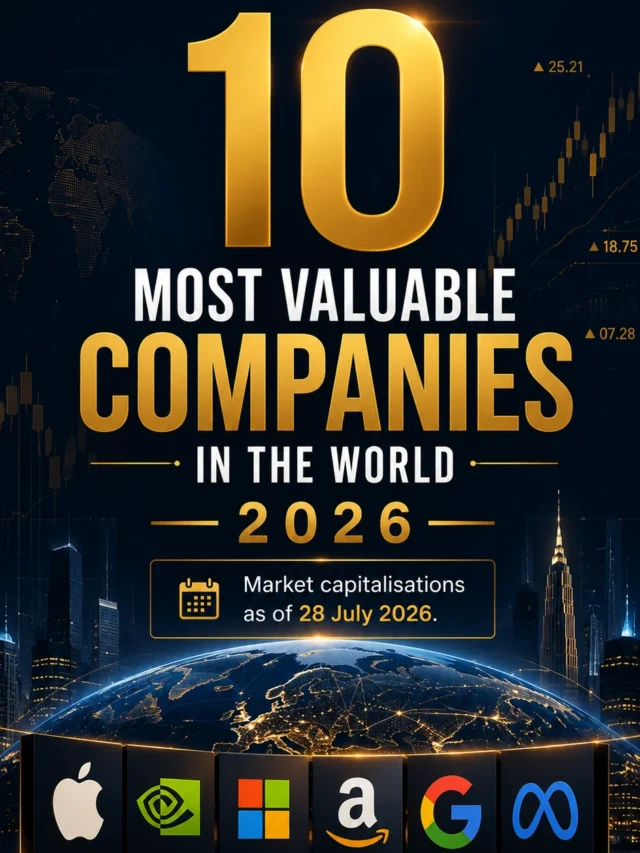
10 Most Valuable Companies in the World in 2026
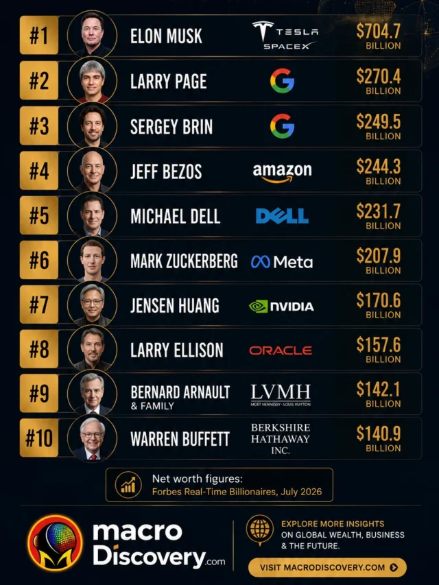
Top 10 Richest People in the World in 2026
The World’s Most Valuable Sports Teams , most valuable sports teams
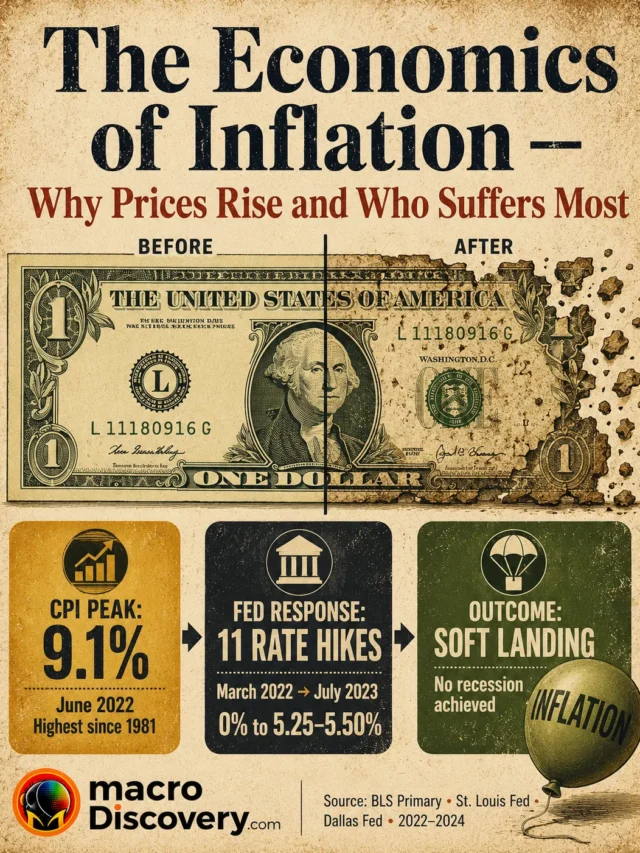
The Economics of Inflation